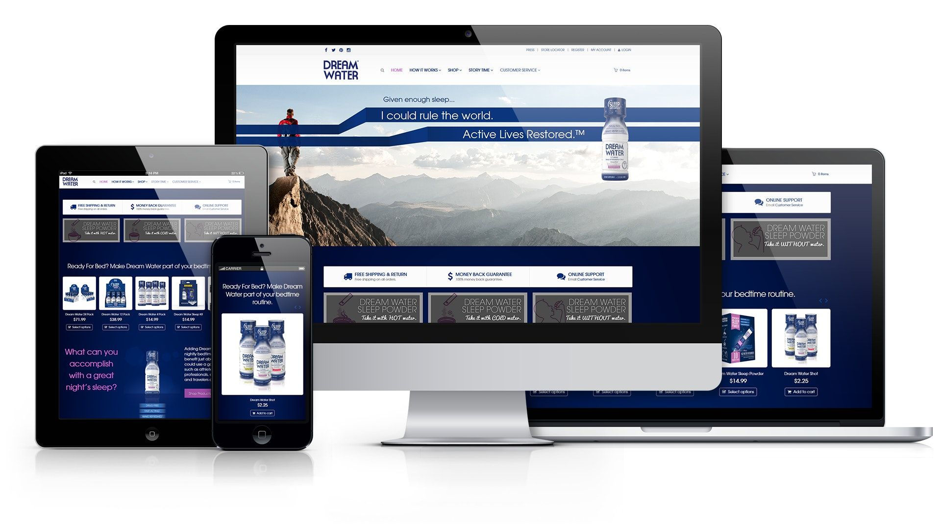
The development of a high-quality website design is a laborious process. Not everyone is ready to devote enough time to it, but this is improper, as the success in sales of goods and services is primarily related to a potential buyer’s visual appropriation of a company.
At the household level, a good example is a buyer’s choice of goods in a grocery store. Indeed, the buyer can choose a product according to their taste or based on a packaging design, but if the product has obvious defects, it is unlikely that it has any chance to get into the buyer’s basket.
Some might think that developing a unique design for a website is too complicated a process that only professionals can cope with, but this is not the case. Designing a website is a long process, but with modern technologies, say, with special programs, which, by the way, are abundant on the Internet, you can easily learn it yourself.
Stage 1. Target Audience Analysis
It is one of the fundamental stages of creating a website design. As soon as its development begins, an owner must imagine those people (their age, character, place of residence, etc.), thanks to whom they will achieve their commercial goals, be it the sale of goods and services or something else. This is an extremely important step. Just imagine the situation when you are selling hearing aids clearly needed by people over fifty years old, but, at the same time, your website is full of bright pictures with rainbow dinosaurs and featuries a cheerful color scheme.
Stage 2. Layout and Elaborating a Style
Any website must have integrity, which implies following a certain style and proper arrangement of blocks. Consider you are making a design for a visitor. When one clicks on a button, everything one needs should be right in front of the reader’s eyes. Information blocks should not be scattered all over a page. Style is also of considerable importance. If you choose a certain style, say, in terms of a particular color scheme, you should follow it on the entire page. Thus, outlines around the blocks should be of the same color. The interrelation of elements is also significant. All the blocks and their properties should have a purpose. Highlighting certain elements is an important part of a website design. A particular block may visually outshine all the others — this is not bad if reasonably implemented, say if you need to make stress on it.

The predominant color of your website is also a highly important matter for the developer. As is well known, any color evokes certain emotions, affects a person in different ways, and causes various associations, thanks to which you can influence a visitor and persuade them to choose your products. The choice of font should also be thoroughly approached, as the success of your website’s promotion depends on it. There is no single rule for choosing a font, so it is worth approaching it logically and intuitively while, at the same time, being sure to keep in mind the target audience. There are a huge number of font types for different purposes, such as:
- Sans-serif fonts. It is one of the most common types used when creating most websites.
- Serif fonts. This type is often used in news portals. It is reminiscent of a newspaper font. It is also often applied on websites dedicated to history.
- Handwritten fonts.
Conclusion
Summing up all of the above, we can conclude that the creation of a website is a subjective matter. As the saying goes, there is no accounting for tastes. It is impossible to take into account everything when creating a website. It will take time and mental effort to develop a truly high-quality website design, but today, in the age of technology, almost anyone can accomplish this.


